

The Beginning
A beautiful business without a clear brand direction.
Sarah had built a growing interior design business with a clear point of view, but her visual identity hadn’t quite caught up.
She knew exactly how she wanted clients to feel when they experienced her work—calm, considered, and elevated—but translating that feeling into a cohesive brand was another story.
The ideas were there. The inspiration was there. What she needed was a clear direction that could bring everything together and give Willow Coast an identity that felt as intentional as the spaces she creates.
The business had evolved. It was time for the brand to evolve with it.
What needed to change
The brand needed more than a prettier logo
01
Clarity
Define what the brand needed to communicate and who it needed to connect with.
02
Cohesion
Bring the colors, typography, imagery, and messaging into one recognizable direction.
03
Confidence
Create an identity Sarah could actually feel excited to use and grow with.
The creative Direction
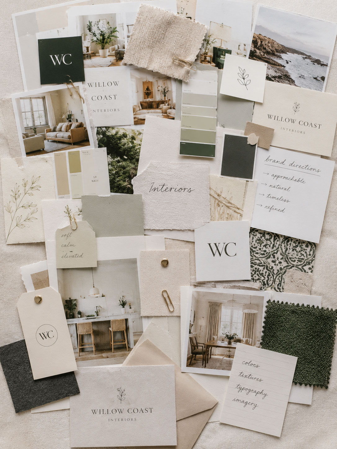
Refined, natural, and quietly confident
The feeling
Warm · Refined · Intentional · Timeless
the palette
The details
Organic Forms · Editorial Typography · Natural Textures
The identity
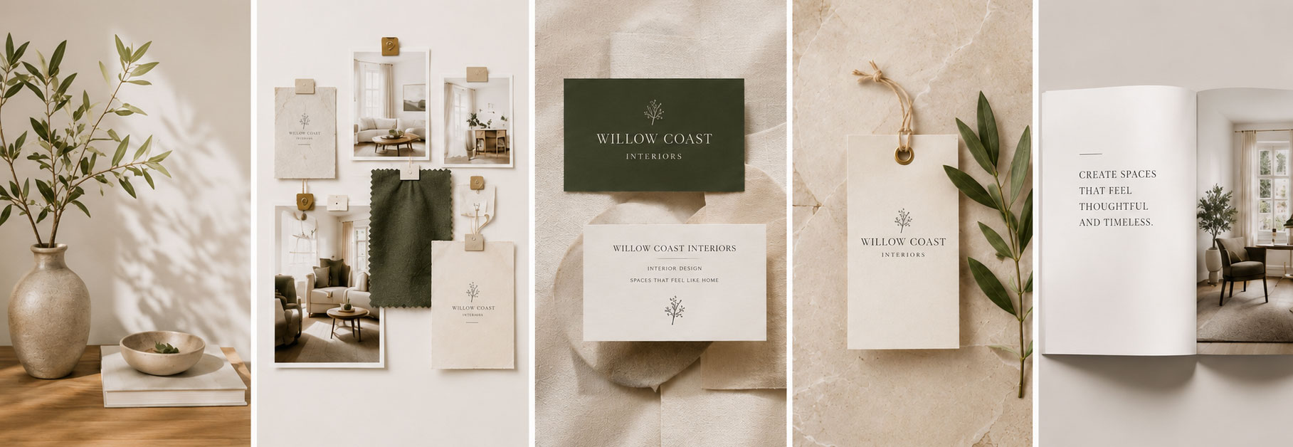
Every piece finally speaking the same language.
From the typography and color palette to the smallest brand details, every element was designed to work together—creating an identity that felt unmistakably Willow Coast.
“For the first time, everything feels connected. I’m not second-guessing every decision anymore—the brand finally feels like the business I’ve been building.”
Sarah